Zendaya's red carpet secret isn't the designer. It's the colour.
Why her most striking looks all have something specific in common.
Zendaya is one of the most watched people on any red carpet. Her looks are studied, discussed, and dissected in detail. The designers get the credit. The stylist Law Roach gets the credit. The construction, the silhouette, the concept.
All of that matters. But there is an underlying factor that rarely gets named, and it is responsible for why some of her looks are simply extraordinary while others are merely very good: the colour.
Specifically: whether the colour is working with her colouring or not.
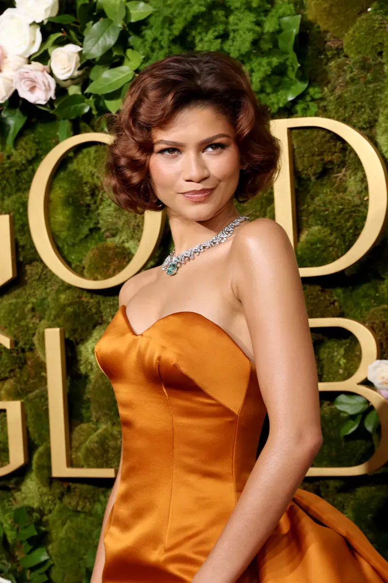
Zendaya is a Deep Autumn.
What is Deep Autumn?
Deep Autumn is one of the twelve seasons in the professional colour analysis system. It sits within the autumn family: warm undertone, high depth, rich saturation. The palette is built on colours that are dark, warm, and earthy. Forest green. Deep burgundy. Chocolate brown. Dark olive. Deep teal. Rich copper. Warm black.
Deep Autumn is the season of depth. Not vivid brightness, not cool jewel tones, but rich, grounded, saturated warmth with real presence. When a Deep Autumn person wears their season colours, the effect is intensity without drama. The colours feel inevitable against the skin, as though they were grown from it rather than placed over it.
Why does Deep Autumn suit Zendaya?
Zendaya has warm, deep golden skin. Dark eyes. Dark hair. The kind of colouring that has genuine depth in every direction. When she wears cool colours, that warmth can look slightly displaced, as though the colour is pulling against rather than with her skin. When she wears warm, deep colours, the warmth in the colour meets the warmth in her colouring, and the result is a harmony that is almost physical in its completeness.
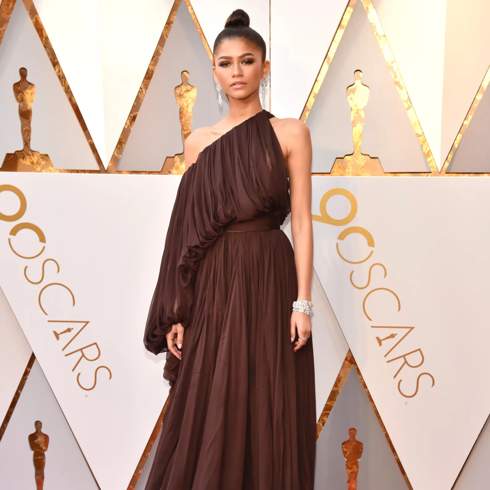
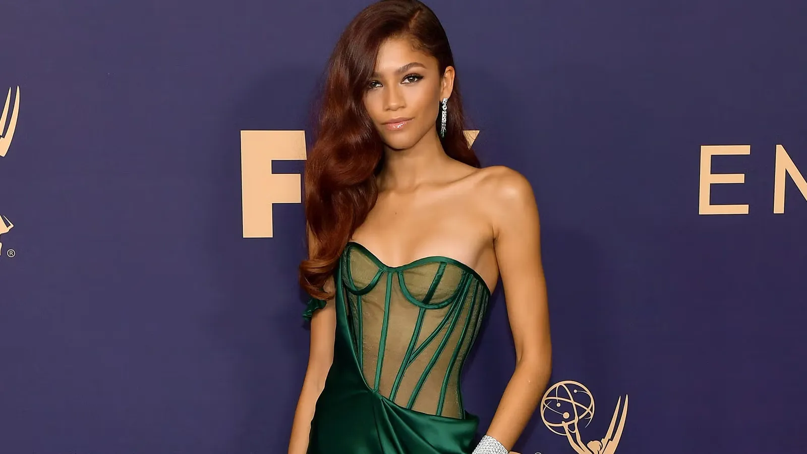
The Valentino forest green. The deep teal Balmain. The rich copper Emmy sequins. The chocolate Valentino at Dune. These are not accidents of styling. They are her season at work.
What are Zendaya's power colours?
The colours that consistently make Zendaya's colouring look most extraordinary are:
Forest green: a dark, warm-based green with depth and richness. Not a cool emerald, not a bright lime. The specific green that reads as earthy and grounded. Against warm dark skin, it creates an effect that is almost luminous.
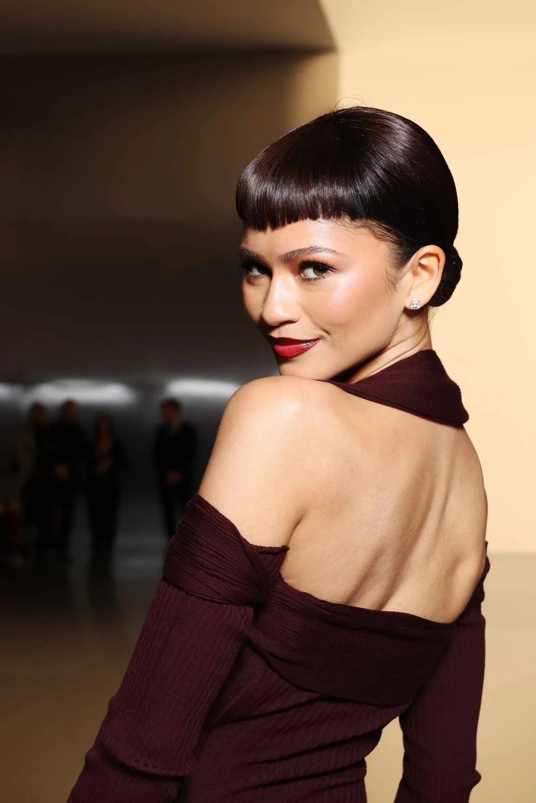
Deep burgundy: a warm, wine-dark red with brown in it rather than blue. Different in effect from the cooler burgundies that suit winter seasons. Rich and grounded.
Chocolate brown: in the right shade, deep brown against warm skin can be extraordinary, particularly in velvet or rich fabrics that have their own depth.
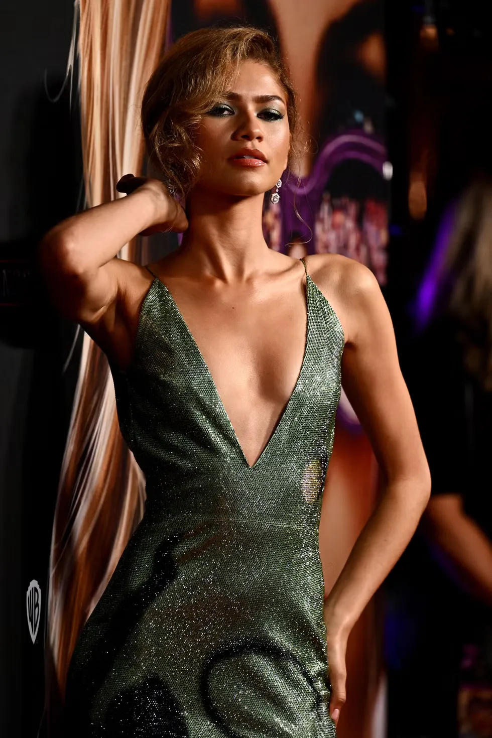
Deep teal: a warm-leaning dark teal with more depth than brightness. Not the cool slate of a summer teal, but the richer, darker version with warmth in it.
Rich copper: one of the most powerful colours in the Deep Autumn palette against warm, deep skin. The metallic warmth creates an extraordinary effect.
Dark olive: the warmest, darkest version of green. Military in tone, earthy in presence. Against Zendaya's golden colouring, it settles with complete naturalness.
When does the formula work less well?
The moments that don't hit with quite the same force tend to share one of two characteristics: they are cool-toned, or they are vivid and clear rather than rich and deep.
Pure cobalt, ice white, or cool silver sit in the winter territory: clear, cool, high contrast. On Zendaya's warm colouring, these colours look good, because she has high-contrast colouring and strong features. But they don't create the same depth of effect as her autumn colours. The harmony is less complete.
Very pale or pastel versions of colours also lose effect. The depth of her colouring needs colours with real presence. Light or muted tones, however beautiful in themselves, don't have enough weight to meet her features.
The author's perspective
What Zendaya's colouring illustrates very clearly is something I find important to say: deep, warm, rich skin is not a colouring that needs to be handled carefully or dressed neutrally. It is one of the most beautiful and flexible colouring types in the system, capable of holding extraordinary depth and richness in colour.
I think there is sometimes an assumption, usually unstated, that bold, saturated colour is risky. In my experience, the opposite is true for people with deep colouring. The richest, most grounded colours are not risky for them. They are precisely right. The risk is in playing it too safe.
What this means beyond the red carpet
The same principle that explains why Zendaya looks extraordinary in forest green applies to your wardrobe. Not because you should wear what she wears, but because you also have specific colouring, and there are colours that create that same quality of depth and harmony for you.
Most people do not know what those colours are in a systematic way. They have instincts, pieces they always reach for, compliments they receive repeatedly about particular things. But without the framework of a season, that knowledge stays approximate and hard to apply consistently.
Questions, answered
Zendaya is a Deep Autumn. Her warm, deep golden skin, dark eyes, and dark hair place her in this season. Her best colours are warm, rich, and deeply saturated: forest green, deep burgundy, chocolate brown, deep teal, rich copper, and dark olive.
Deep Autumn is one of the twelve seasons in the seasonal colour analysis system. It is characterised by warm undertone, high depth, and rich saturation. The palette avoids anything cool or pastel, favouring colours with warmth, depth, and presence.
Part of it is styling, construction, and the clothes themselves. But the underlying factor in her most extraordinary looks is colour alignment: the colours she wears at her best are specifically the ones that harmonise with the warmth and depth of her colouring.
Deep Autumn colouring typically has warm undertone, high depth in skin, hair, and eyes, and a naturally rich, golden, or earthy quality to the complexion. A professional colour analysis will confirm this accurately.
mycolours.ai identifies your exact season from two selfies, building a personal palette of 19 colours alongside makeup matches, hair guidance, and a capsule wardrobe. Start your analysis at mycolours.ai.
Melissa O'Neill
Style Editor at mycolours.ai
Melissa O'Neill is the style editor at mycolours.ai. She started her career on the Paul Smith concession at Harrods, where she learned that the difference between looking ordinary and looking incredible often comes down to colour, not cost. She has since built and run luxury boutique hotels, businesses where every detail, from the linen shade to the lighting warmth, was chosen to make people feel something. She started mycolours.ai because she believes the tools to look and feel your best should not cost £300 or require a stylist on speed dial.
More on colour
What Julia Roberts, Julianne Moore and Amy Adams have in common, and why it matters for your wardrobe
Julia Roberts, Julianne Moore and Amy Adams are all warm-toned, but belong to different seasons. Understanding why reveals something fundamental about how colour actually works.
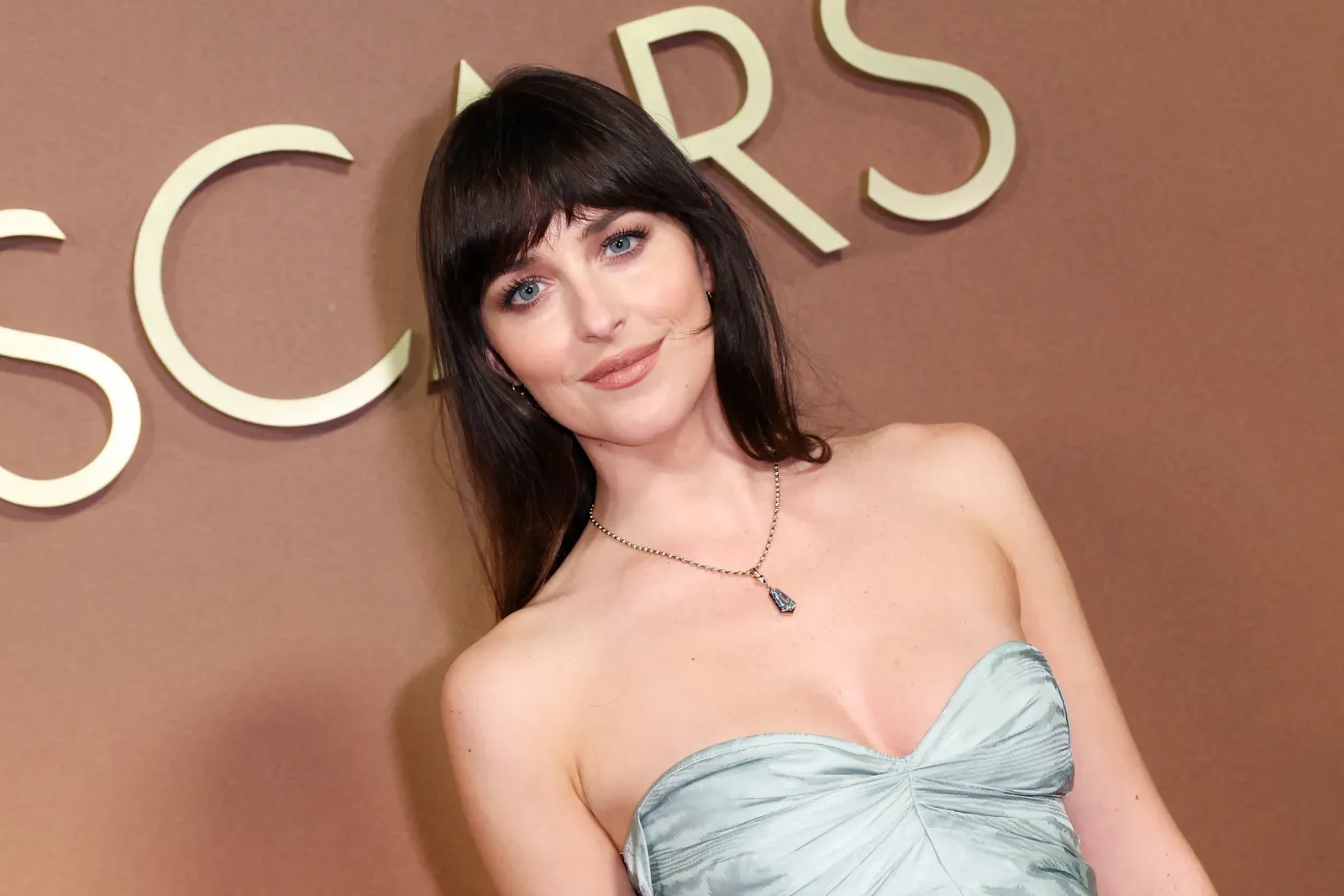
Dakota Johnson always looks effortless. Here is the colour reason why.
Dakota Johnson's quietly consistent style has a colour reason behind it: she is a Soft Summer, and her best looks prove exactly what that means.
Why Anne Hathaway always looks stunning: and what it tells you about your own wardrobe
Anne Hathaway's most striking looks share one thing: they are all Deep Winter colours. Here is the colour science behind her best outfits and what it means for your wardrobe.
Your exact colours, from two selfies.
mycolours reads your skin, hair, and eyes and returns your colour season, a 19-colour palette, makeup matches, hair guidance, and a capsule wardrobe in 60 seconds, for £7.99.