
The colour mistake most women make without knowing it
It is not wearing the wrong trend or the wrong style. It is something more fundamental.
There is one colour mistake that appears more consistently than any other, across wardrobes at every budget, on women at every age and every body type. It is not a stylistic error. It is not about proportion or silhouette or occasion. It is about colour temperature, and most people making it have no idea.
The mistake: building a wardrobe around colours that feel safe and neutral, without realising that many of those colours have a specific temperature that may be working against your skin.
What is the mistake, exactly?
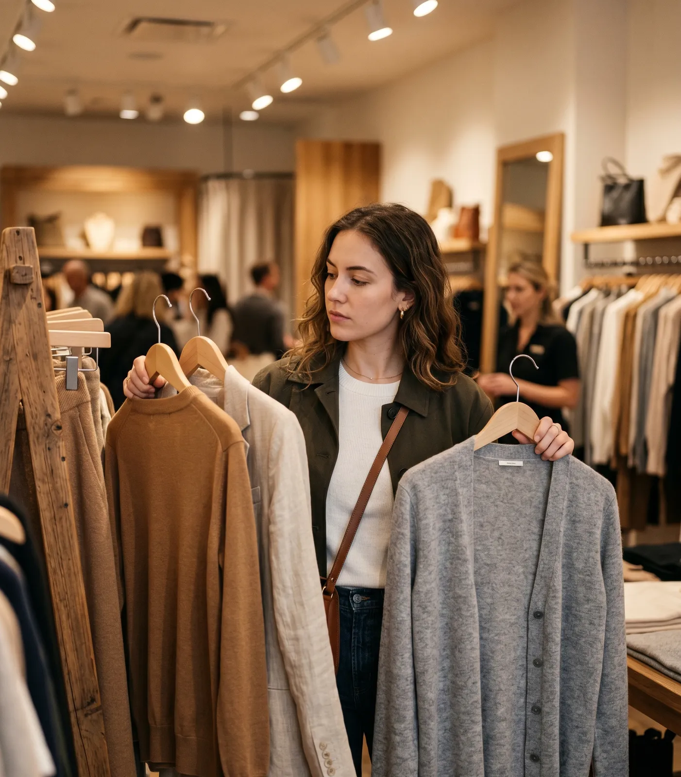
Most wardrobes are anchored in neutrals. Black, grey, navy, beige, camel, white, cream. These are the colours most people default to because they feel safe, they go with everything, and they don't require the confidence of a statement.
The problem is that neutrals are not neutral. They have undertones.
Black is cool. Camel is warm. True navy is cool. Warm camel-beige is warm. Cream is warm. Stark white is cool. Classic grey is usually cool, though it varies by shade. These undertones interact with your skin in exactly the same way as any other colour. And for many people, the neutrals they have built their wardrobe around have the wrong undertone for their skin.
A warm-toned person in a predominantly cool-neutral wardrobe will look consistently slightly off, consistently slightly drained, without being able to identify why. Because the colours are neutral. Because they are safe. Because nobody told them that safe and right are not the same thing.
Why this matters more than any other mistake
A wardrobe where the neutrals are wrong is a wardrobe where everything is slightly diminishing, all the time. The issue is not in a specific piece or a specific occasion. It is structural. The colours that appear most frequently are the ones most consistently working against the wearer.
The same energy spent on capsule wardrobes, investment pieces, and classic styling can produce a result that is merely adequate because the underlying colour logic is off.
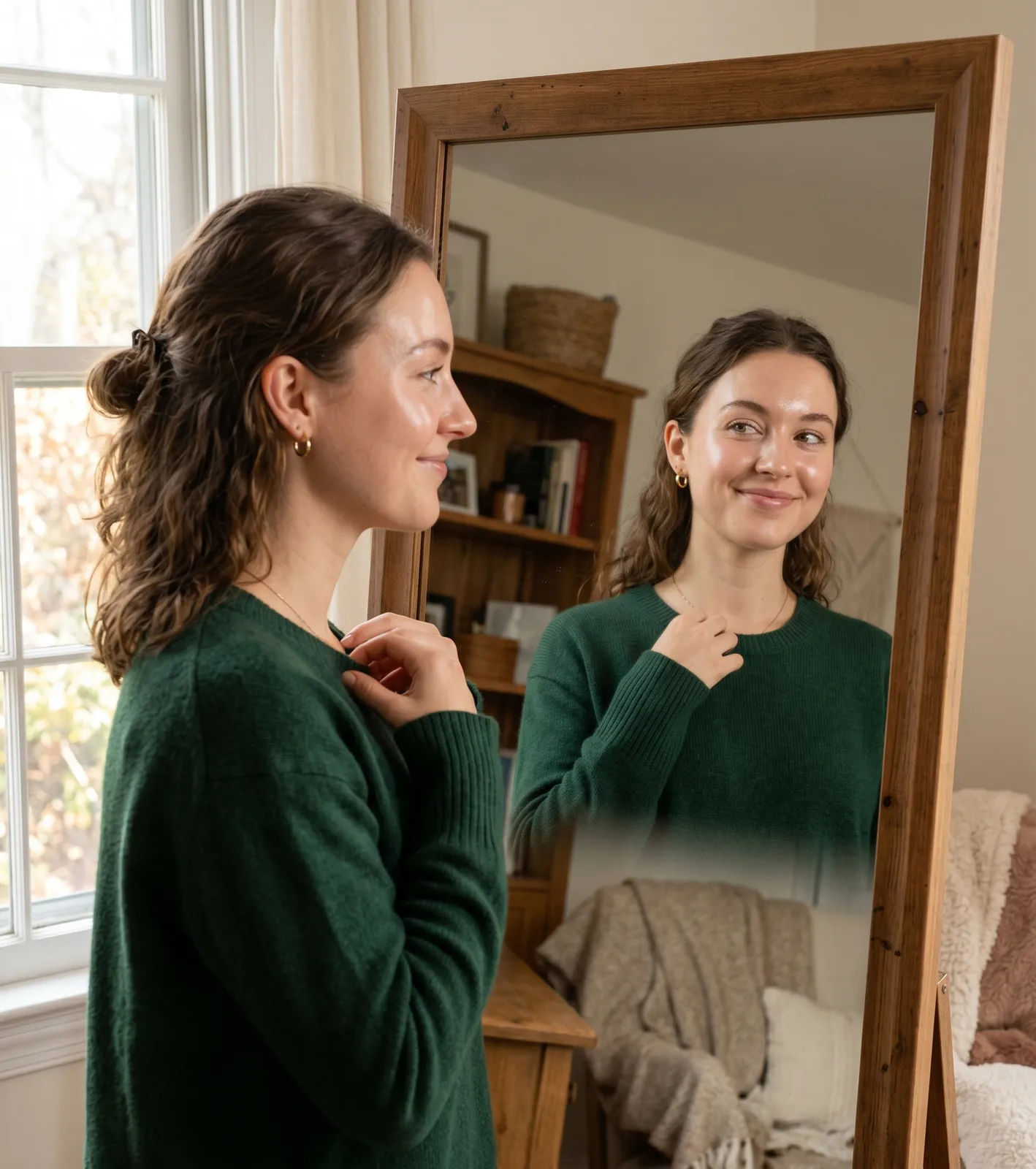
Fixing the neutrals changes more than anything else. When the most-worn colours are in the right family, everything built on top of them works better.
Which neutrals should warm-toned people use?
Warm-toned colouring (yellow, golden, or peachy undertone) looks best in neutrals that share that warmth:
Dark neutrals: chocolate brown, warm charcoal, camel, dark olive, warm navy with a green cast rather than a blue one.
Mid neutrals: warm taupe, camel, warm greige (grey with a yellow or brown cast rather than a blue one), soft ivory.
Light neutrals: warm white or cream rather than stark cool white, warm ivory, warm soft beige.
The warm version of almost every neutral exists. Finding it is a matter of looking at the undertone of the shade rather than accepting the generic version.
Which neutrals should cool-toned people use?
Cool-toned colouring (pink, blue, or ashy undertone) looks best in neutrals that share that coolness:
Dark neutrals: true navy, cool charcoal (blue-grey rather than brown-grey), cool black, dark cool grey.
Mid neutrals: cool grey, slate, cool greige (grey with a blue cast rather than a yellow one), cool mushroom.
Light neutrals: pure white rather than cream or ivory, pale cool grey, light cool stone.
Why do so many wardrobes get this wrong?
Several reasons.
Fashion tends to present neutrals as a single category. The beige of one season, the grey of another, the camel of the next. These are offered as universally flattering without acknowledgment that they have undertones that work differently on different people.
Shopping under artificial light makes undertone differences harder to see. The golden warmth of a camel and the cool flatness of a greige can look more similar under shop lighting than they do in daylight against skin.
And there is no cultural framework in which most people are taught that neutral colours are not neutral. This is an absence of education rather than a failure of taste.
The author's perspective
This is the thing I find most worth saying to people who are frustrated with their wardrobes. When getting dressed is consistently harder than it should be, when things that look good individually don't quite work together, when you always look slightly less like yourself than you want to: the most likely explanation is not the styling, not the pieces, not the budget.
It is the colour. Specifically, the neutrals.
Getting the base palette right is, in my view, one of the most underrated acts of style. Not glamorous, not particularly visible, but profoundly impactful on how every other choice lands. A wardrobe built on the right neutrals creates a foundation where almost everything works. A wardrobe built on the wrong ones requires constant effort to compensate.
How to fix it without starting over
You do not need to replace your entire wardrobe. A practical approach:
First, identify your undertone. Warm or cool? (A colour analysis will confirm this accurately.)
Second, look at your most-worn neutrals and assess their undertone. Warm browns and camels are warm. Cool greys and pure whites are cool. Be honest about which category most of your wardrobe sits in.
Third, if there is a mismatch, begin replacing the highest-frequency items: your most-worn coat, your most-worn bag, your most-worn base layer. These pieces appear in the most outfits, so replacing them with the right temperature has the biggest cumulative impact.
Fourth, keep pieces that work and stop buying from the wrong temperature family. Over time, the balance shifts.

Questions, answered
Most beige is warm, with a yellow or sandy undertone. However, beige exists in cooler versions, sometimes called cool stone or greige, that have a more grey, blue-toned cast. The specific shade matters more than the name.
True navy (deep, blue-based navy) is cool. However, some navies lean slightly towards green or warm, which makes them more versatile. Examining the specific undertone of the navy rather than assuming it is universally cool is worth doing.
Below the waist, the rules are considerably more relaxed. A camel trouser on a cool-toned person is unlikely to cause problems. The issue is primarily with pieces nearest the face. Prioritise getting the temperature right in tops, jackets, scarves, and necklines.
If you have neutral undertone, yes. If you have a strong warm or cool undertone, mixing both temperature families in one outfit can create a subtle visual incoherence. Staying within one temperature family per outfit produces the most polished result.
mycolours.ai identifies your complete season and palette from two selfies, including the specific neutrals calibrated to your colouring. Start your analysis at mycolours.ai.
Melissa O'Neill
Style Editor at mycolours.ai
Melissa O'Neill is the style editor at mycolours.ai. She started her career on the Paul Smith concession at Harrods, where she learned that the difference between looking ordinary and looking incredible often comes down to colour, not cost. She has since built and run luxury boutique hotels, businesses where every detail, from the linen shade to the lighting warmth, was chosen to make people feel something. She started mycolours.ai because she believes the tools to look and feel your best should not cost £300 or require a stylist on speed dial.
More on colour
Why do some colours make me look tired?
A perfectly nice outfit can still leave you looking drained. Here is how undertone, depth and contrast decide whether a colour lifts your face or flattens it.

Why black doesn't suit everyone, and what to wear instead
Black is supposed to go with everything and suit everyone, but for a significant proportion of people it is one of the most draining colours they own.
Why some clothes make you glow and others make you disappear
Some outfits just look right. Others fall flat. The difference comes down to three colour variables, and understanding them changes how you get dressed forever.
Your exact colours, from two selfies.
mycolours reads your skin, hair, and eyes and returns your colour season, a 19-colour palette, makeup matches, hair guidance, and a capsule wardrobe in 60 seconds, for £7.99.