Why do some colours make me look tired?
The answer isn't your makeup, your sleep, or your age. It's your clothes.
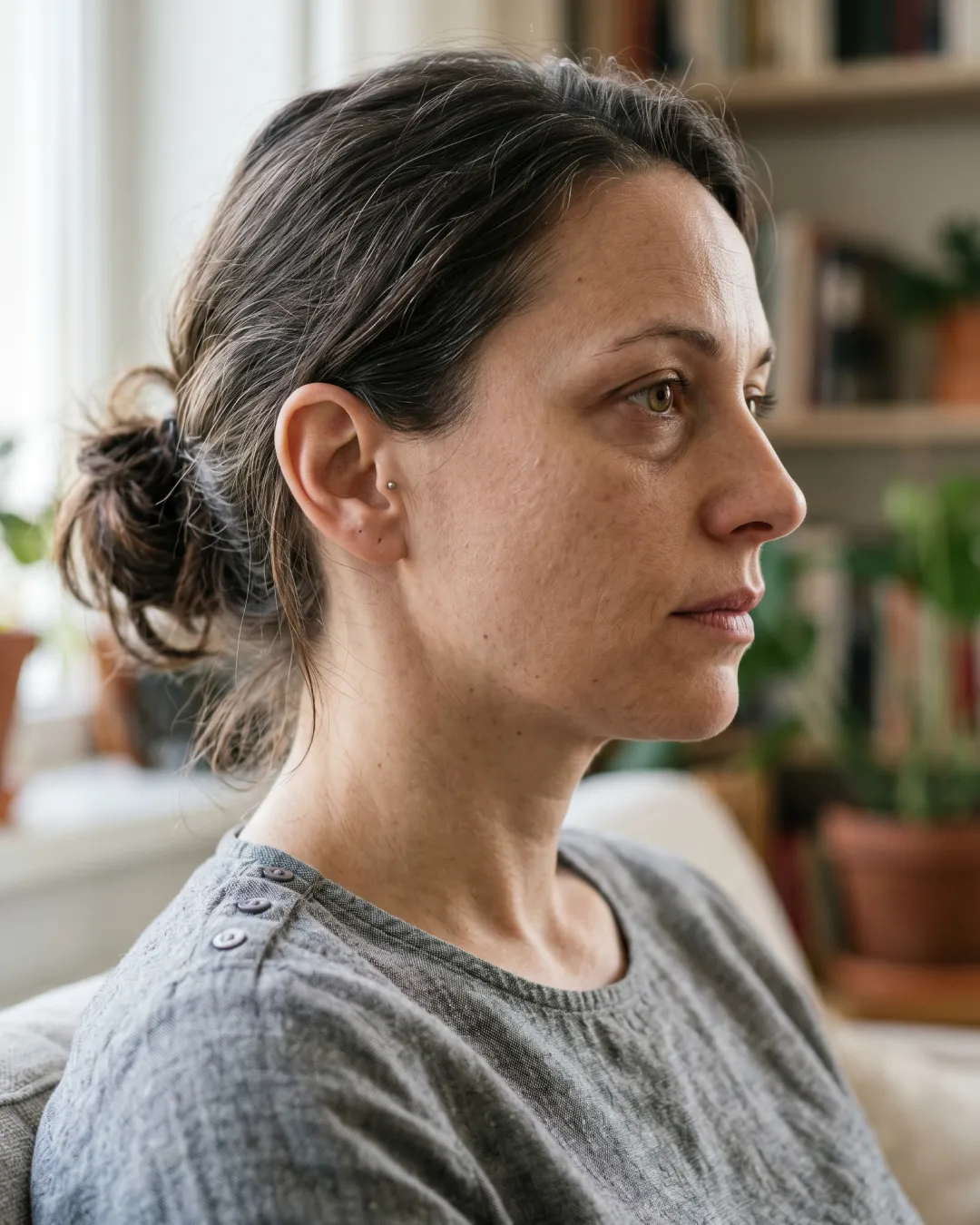
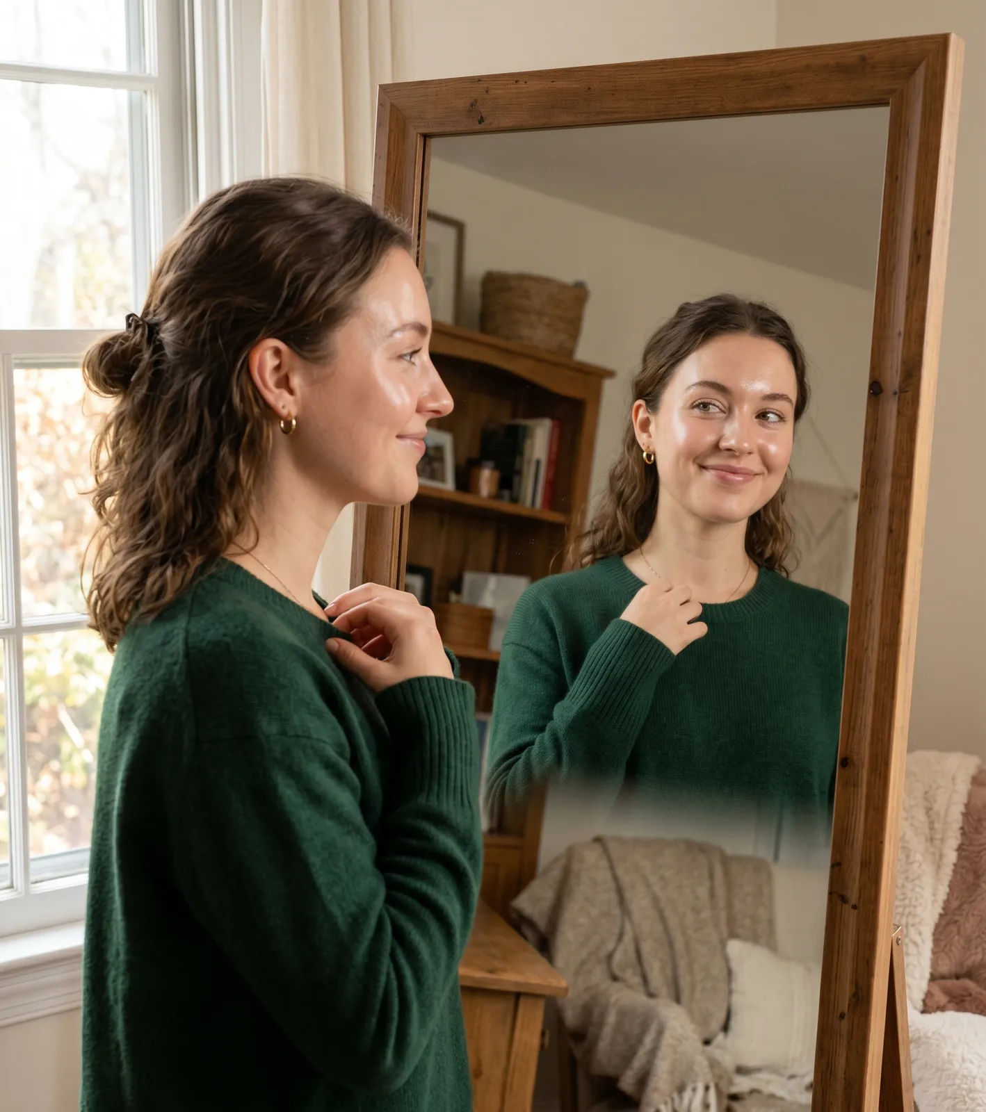
There's a particular kind of frustration that comes from putting on a perfectly nice outfit and looking in the mirror to find someone who appears exhausted. You slept well. Your skin is fine. But something about the colour you're wearing is making your face look flat, shadowy, and drained.
This is one of the most common, and most overlooked, style problems. And the good news is that it has nothing to do with how you look. It has everything to do with the colour you've chosen.
Why do colours make you look tired?
Colours make you look tired when the undertone of the fabric conflicts with the undertone of your skin.
Your skin has a natural undertone: a cool, warm, or neutral base that sits beneath the surface. When you wear a colour that shares your undertone, your skin looks clear, even, and alive. When you wear a colour that works against it, your skin picks up the conflict and reflects it back as shadows, greyness, and the appearance of fatigue or illness.
It's not that the colour is ugly. It's that the colour is wrong for you specifically.
What is undertone and why does it matter?
Undertone is the fixed, natural hue beneath your skin that never changes regardless of how tanned or pale you are on any given day. Unlike your surface skin tone, which shifts with sun exposure, seasons, and health, your undertone stays constant throughout your life.
There are three categories:
Warm undertone: a yellow, peachy, or golden base. Warm-toned skin glows in earthy colours, warm reds, and golden tones. It looks drained and greyish in cool blues, ash tones, and stark whites.
Cool undertone: a pink, blue, or ashy base. Cool-toned skin lights up in jewel tones, dusty roses, and cool neutrals. It looks sallow and washed out in warm oranges, camel, and mustard.
Neutral undertone: a balance of both. Neutral-toned skin is the most versatile but still has better and worse colour families.
Most people have a dominant undertone they're not consciously aware of. But their wardrobe often reflects it unconsciously. The colours they reach for again and again tend to be the ones that work.
Why do some colours make skin look grey or shadowy?
When a colour has a grey, dull, or conflicting undertone relative to your skin, it reflects that dullness upward onto your face. The visual effect is an increase in shadows: under the eyes, around the nose, along the jawline. These are exactly the areas we associate with tiredness.
This is why the same grey top can look sophisticated on one person and corpse-like on another. It's not the grey itself. It's whether that particular shade of grey has a warm or cool base, and whether that matches or conflicts with the wearer's skin.

Does depth and contrast matter too?
Yes, and this is the part most colour advice misses.
Beyond undertone, the depth and intensity of a colour also matters. Some people have colouring with a lot of natural contrast: dark hair, light skin, bright eyes. They need colours with some intensity to match that energy. Wearing very muted, blended colours makes them look washed out because the colour has less presence than their own features.
Other people have softer, more blended colouring: medium tones throughout, lower contrast. They look best in muted, gentle colours. Strong, highly saturated colours can overpower them, drawing attention away from their face and making their skin look pale by comparison.
This is why the "wear bold colours if you want to stand out" advice so often backfires. For some people, a bold colour is exactly what their colouring needs. For others, it competes with rather than complements their natural features.
How do I know which colours are making me look tired?
There are a few quick tests:
The natural light test. Hold a piece of clothing up against your face in natural daylight with no makeup on. Look at your skin rather than the fabric. Does your skin look clear and even, or do shadows appear under your eyes and around your nose? If shadows increase, the colour is working against you.
The gold and silver test. Hold a piece of gold fabric near your face, then silver. Whichever makes your skin look more even and your eyes brighter indicates your undertone direction. Gold suggests warm, silver suggests cool.
The colours you avoid test. Most people already know, intuitively, which colours drain them. They've just never understood why. Think about the colours you rarely wear even though you like them. Chances are your instincts already know they don't work. You just haven't been given the language to explain it.
Is this what colour analysis actually does?
Yes. Colour analysis is the systematic version of this process.
It identifies your undertone, your depth, and the intensity your colouring needs, and maps those three characteristics to a personal colour palette. When you know your palette, you stop buying colours that make you look tired and start building a wardrobe where everything you own makes you look like the best version of yourself.
The traditional version of a colour analysis involves an in-person session with a consultant, draped in fabric, assessing how each colour reflects onto your skin. It's precise and genuinely transformative, and historically it cost hundreds of pounds and required booking months in advance.
mycolours.ai is a considered, expert-built alternative. Built on professional colour consultancy expertise, the analysis takes two selfies and delivers your exact season, a 19-colour personal palette, makeup colour matches, hair guidance, and a capsule wardrobe. For £7.99.
It's not a quiz. It's not a generic result based on hair colour alone. It's the same analytical framework as an in-person session, made accessible.
Questions, answered
Grey is one of the most common culprits. Most greys have either a cool-blue or warm-yellow undertone, and if that conflicts with your skin's undertone, the grey reflects dullness and shadow upward onto your face. The fix isn't avoiding grey. It's finding the specific shade of grey that works with your colouring.
Black is high contrast. For some colour types, particularly those with naturally high contrast colouring, black is extremely powerful. For others, especially those with softer, lighter, or warmer colouring, black worn near the face emphasises shadows and makes skin look pale and tired. A deep navy, rich espresso, or charcoal often does the same job without the harshness.
Yes. Research into visual perception shows that colours which flatten natural facial contrast or reflect grey tones onto the skin are consistently perceived as adding years. The right colours support your skin's natural vibrancy; the wrong ones suppress it.
Because you have different colouring. The same colour reflects differently depending on the undertone, depth, and contrast of the person wearing it. What glows on a warm-toned person can drain a cool-toned person, and vice versa. This isn't about who is more attractive. It's colour science.
A professional in-person colour analysis is the gold standard but runs to several hundred pounds. mycolours.ai delivers expert colour analysis from two selfies for £7.99, giving you your personal season, your exact 19-colour palette, makeup matches, and capsule wardrobe guidance.
Your undertone itself is fixed. However, as your hair lightens with age or you go grey, the overall visual impression of your colouring can soften. This may mean some colours that worked in your twenties feel too strong now, and softer versions of your palette serve you better. The season stays the same; the specific shades within it may shift.
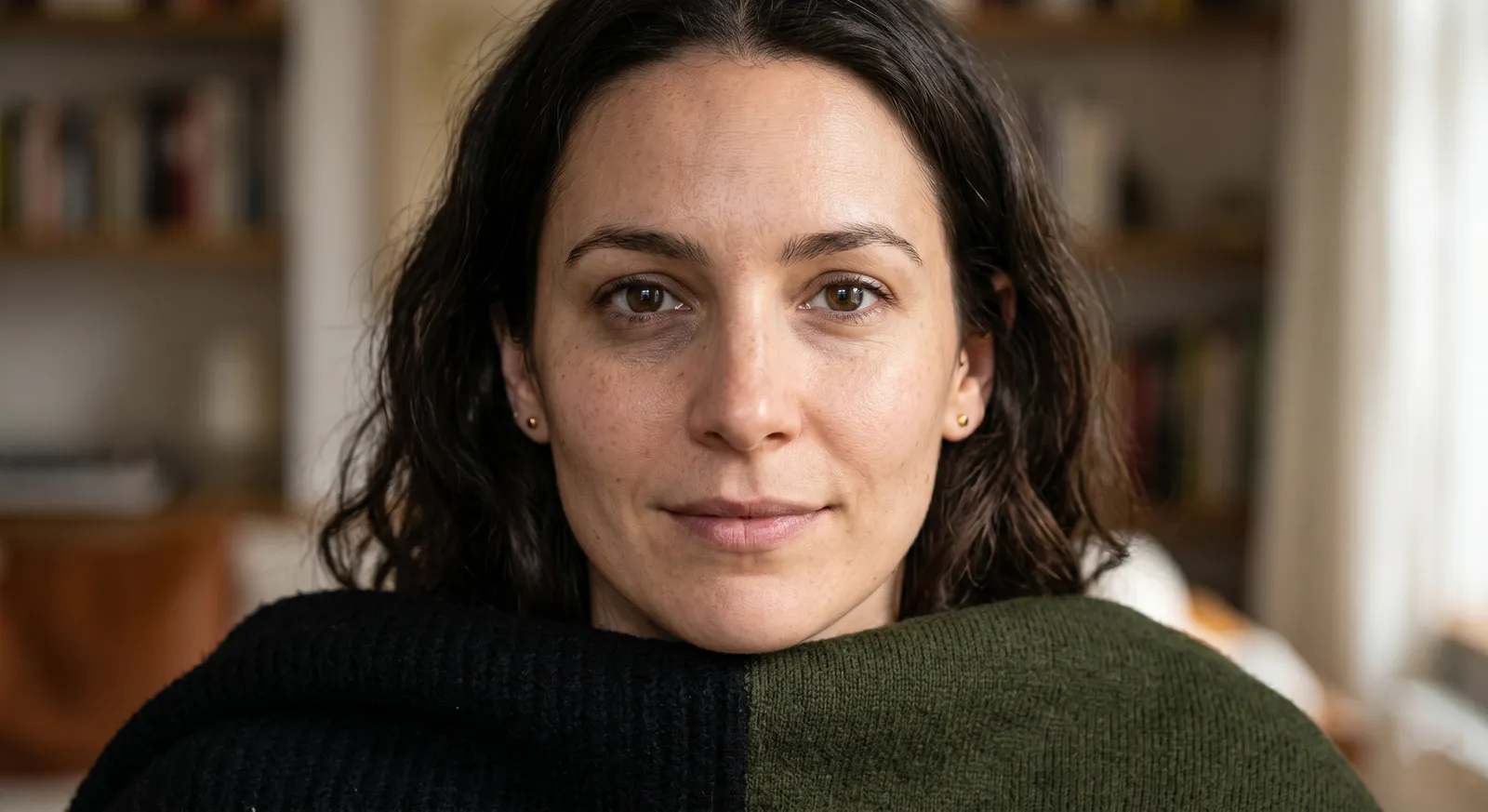
Melissa O'Neill
Style Editor at mycolours.ai
Melissa O'Neill is the style editor at mycolours.ai. She started her career on the Paul Smith concession at Harrods, where she learned that the difference between looking ordinary and looking incredible often comes down to colour, not cost. She has since built and run luxury boutique hotels, businesses where every detail, from the linen shade to the lighting warmth, was chosen to make people feel something. She started mycolours.ai because she believes the tools to look and feel your best should not cost £300 or require a stylist on speed dial.
More on colour

The colour mistake most women make without knowing it
Most wardrobes are built on neutrals that feel safe, but neutrals are not neutral. Here is why getting the temperature of your basics right changes everything.
Why black doesn't suit everyone, and what to wear instead
Black is supposed to go with everything and suit everyone, but for a significant proportion of people it is one of the most draining colours they own.
Why some clothes make you glow and others make you disappear
Some outfits just look right. Others fall flat. The difference comes down to three colour variables, and understanding them changes how you get dressed forever.
Your exact colours, from two selfies.
mycolours reads your skin, hair, and eyes and returns your colour season, a 19-colour palette, makeup matches, hair guidance, and a capsule wardrobe in 60 seconds, for £7.99.