Why some clothes make you glow and others make you disappear
You have felt this. Here is what is actually happening.
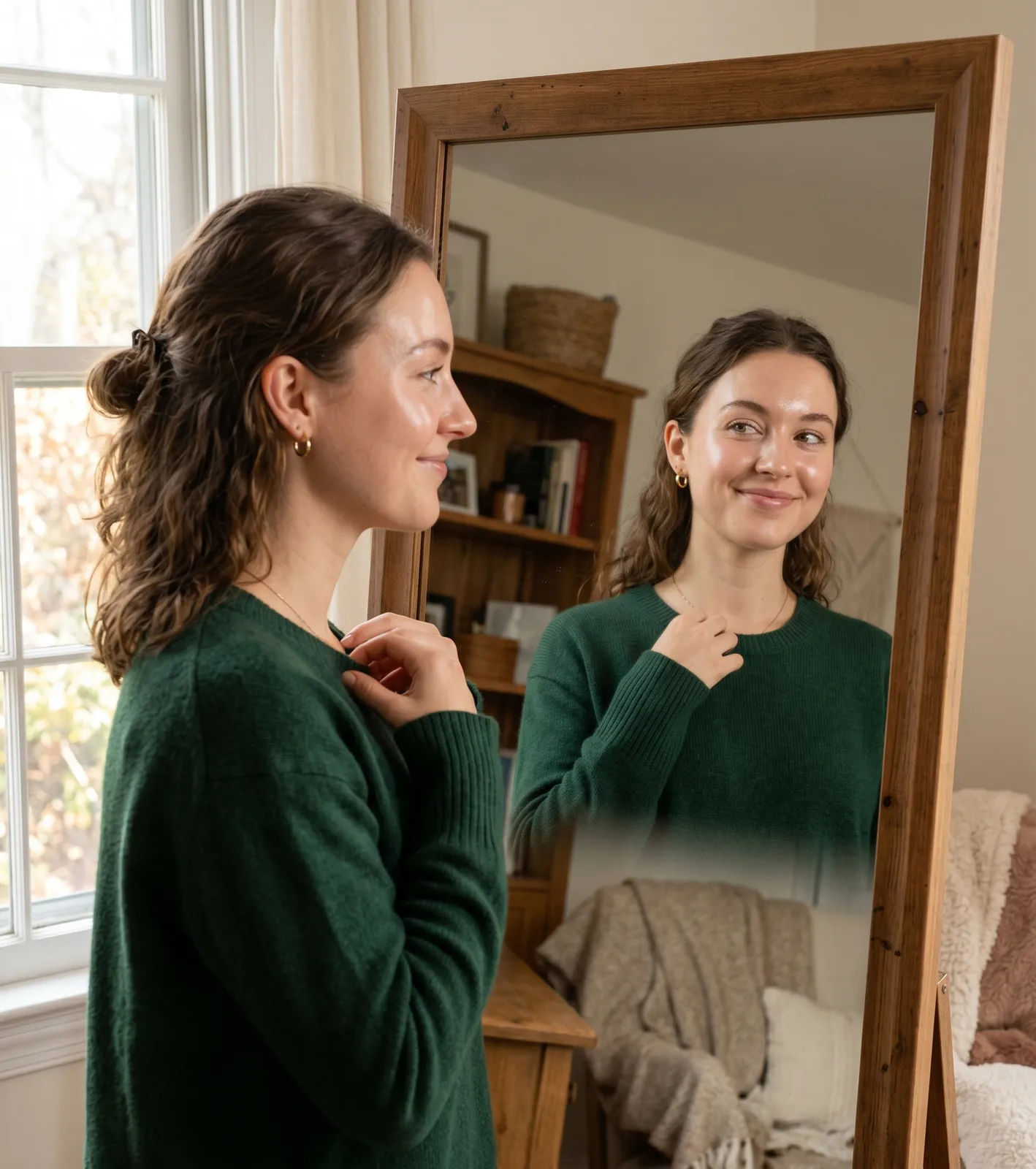
You know the feeling. You put something on and just look right. Not because it's a particularly special piece, or expensive, or fashion-forward. Just right. Your skin looks good. You look rested. There's a coherence to the whole thing that makes getting dressed feel easy.
And you know the other feeling. The perfectly good outfit that looks somehow flat. The colour that seemed fine in the shop and looks wrong at home. The top that makes you look like you need more sleep than you got. You can't quite name what's off, but something is.
This is not about the quality of the clothes. It is about the colour.
Why does clothing make you look better or worse?
Clothing worn near the face reflects its colour upward onto the skin. This is a physical fact, not a perception. The colour in the fabric emits and reflects light at specific wavelengths, and some of that light hits your face.
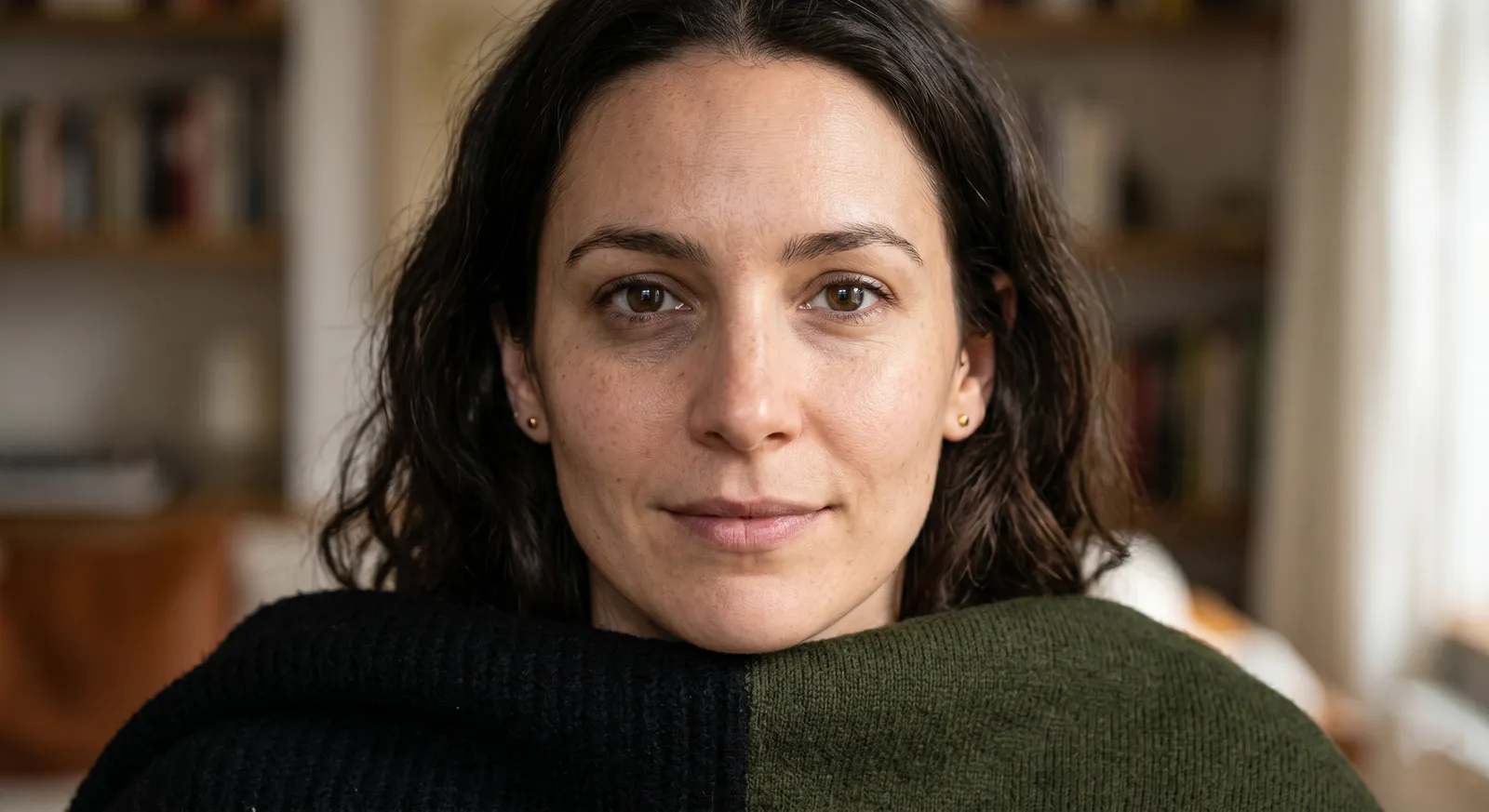
When the reflected colour shares characteristics with your skin's natural undertone, it reinforces and amplifies what is already there. Your skin looks clearer, more even, more alive. Features appear more defined. The overall impression is that you look well, rested, and vibrant.
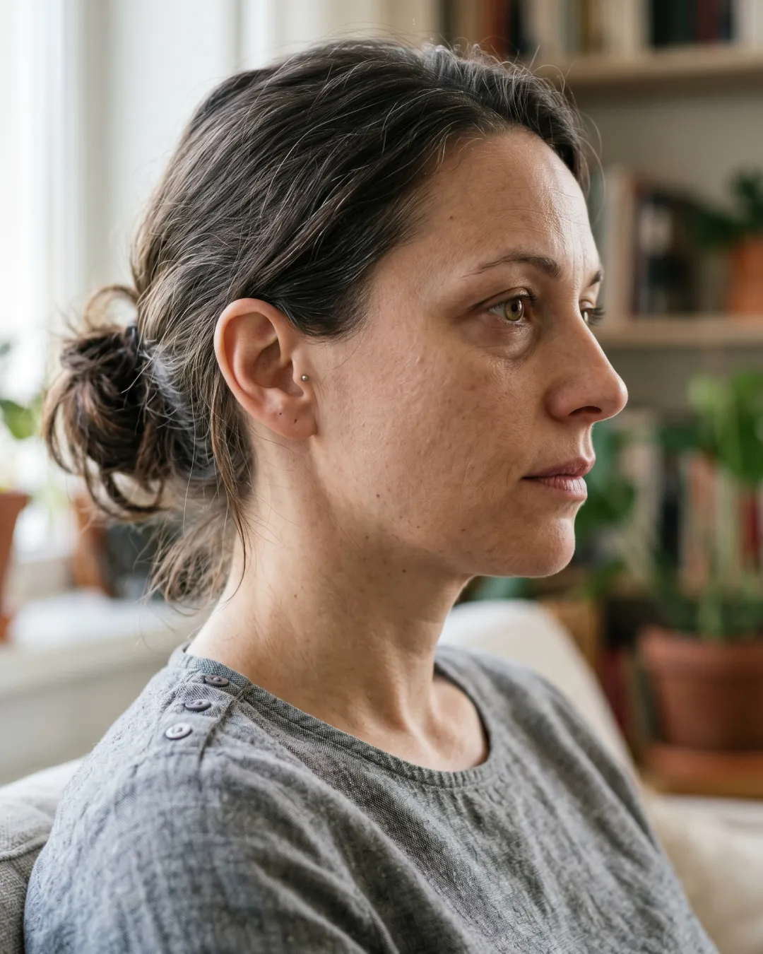
When the reflected colour conflicts with your undertone, it introduces a competing tone onto your skin. The result is shadows where there weren't any, a greying or yellowing of the complexion, a loss of definition in the features. The overall impression is the one that makes people ask if you're feeling alright.

What makes a colour "right" for you?
Three things, working together:
Temperature. Every colour has a warm or cool undertone. So does your skin. When they match, the effect is harmony. When they conflict, the effect is dissonance that shows on your face.
Depth. Some people have very light, delicate colouring. Others have deep, rich colouring. Some sit in between. Colours work best when their depth is broadly proportionate to the depth of the person wearing them. Wearing very deep, saturated colour with very light colouring can create an overpowering effect where the colour dominates the face. Wearing very pale colour against very deep colouring can create a washed-out quality where neither the colour nor the face lands properly.
Saturation. This is the variable most people don't know to look for. Some people have clear, high-contrast colouring. Others have softer, more blended colouring. Clear colouring needs vivid, fully saturated colours to match. Soft colouring needs muted, blended colours to match. Getting this wrong creates either an overwhelming effect or a washed-out one.
When all three are right simultaneously, you glow. When any one of them is off, you disappear.

Why does this happen with colours you like?
This is one of the most frustrating aspects of the whole thing. Liking a colour and looking good in it are separate questions.
You might genuinely love the look of a golden mustard. It might look beautiful in the shop. On the hanger, in a photograph, on someone else, it might be extraordinary. But if your undertone is cool, the warm golden base of that mustard will conflict with your skin's natural quality, and the effect on your face will be a subtle but real dullness.
The same applies in reverse. Someone with warm colouring might love the idea of a cool slate blue. And it might look beautiful in exactly the same way. And it might create exactly the same problem when worn.
Colour analysis helps you understand why the colours you are drawn to sometimes don't look as good as you expect them to, and helps you find the versions of those colours that do work: the mustard with more warmth or the blue with more muted depth, adjusted to your specific colouring.
Why do some people seem to look good in everything?
They probably don't, but they may not notice when something isn't quite working because they haven't seen it clearly against something that is.
More likely, they have naturally versatile colouring: neutral undertone, medium depth, moderately blended saturation. This kind of colouring sits comfortably in a wider range without obvious clashes, because the variables are not extreme in any direction.
The people who benefit most dramatically from colour analysis tend to be those with more distinct colouring: a very warm golden skin tone, or very cool ash colouring, or very light and delicate features, or very deep and high-contrast ones. The more specific your colouring, the more precisely the colours need to be matched, and the more striking the difference between wrong and right becomes.
The author's perspective
I have a particular view on this. Most people, when they look in the mirror wearing the wrong colour, conclude something about themselves: that they look tired, that they look older, that something about their face is the problem.
In nearly every case, it is not the face. It is the colour.
I find this genuinely important to say, because the damage that bad colour choices do to people's confidence in their own appearance is real, and it is entirely avoidable. Every person I have worked with has colouring that is beautiful in its own right. The work is not in improving the person. It is in finding the colours that make visible what was already there.
When someone puts on a colour that is right for them for the first time and sees what it does, the most common response is surprise. Not at a transformation, but at a recognition. "That looks like me." That is the whole point.
How to find the colours that make you glow
The most reliable method is natural light comparison. Take pieces in different colour families, hold them close to your face without makeup in daylight, and observe your skin rather than the fabric.
The right colour will make your skin look clearer and more even. The wrong one will create shadows and dullness. The difference is usually visible within seconds.
Over time, this process shows you the colour families that consistently work, which correspond to your colour season.
Questions, answered
Fitting room lighting is almost always artificial and heavily controlled. It is designed to make people look good and feel confident enough to buy. Natural daylight is more revealing. The colours that look fine under flattering artificial light will show their true interaction with your skin in daylight.
It can make you look more rested, more defined, and more vibrant, all of which contribute to a perception of youth and health. The effect is not cosmetic. It is the result of colours not pulling shadows onto your face or dulling your natural colouring.
Most people's wardrobes contain a mix of good and less good, because instinct does some of the work even without a framework. The first step is identifying your season and testing existing pieces against it. The second step is replacing wrong purchases with right ones over time.
The effect is strongest in natural light but consistent across lighting conditions. A colour that genuinely works with your colouring will be flattering in all lights, even if the degree of the effect varies.
mycolours.ai identifies your exact season and builds a personal palette of 19 colours calibrated to your specific colouring: the colours that will make you look clear, defined, and like yourself, every time. Start your analysis at mycolours.ai.
Melissa O'Neill
Style Editor at mycolours.ai
Melissa O'Neill is the style editor at mycolours.ai. She started her career on the Paul Smith concession at Harrods, where she learned that the difference between looking ordinary and looking incredible often comes down to colour, not cost. She has since built and run luxury boutique hotels, businesses where every detail, from the linen shade to the lighting warmth, was chosen to make people feel something. She started mycolours.ai because she believes the tools to look and feel your best should not cost £300 or require a stylist on speed dial.
More on colour
Why do some colours make me look tired?
A perfectly nice outfit can still leave you looking drained. Here is how undertone, depth and contrast decide whether a colour lifts your face or flattens it.

The colour mistake most women make without knowing it
Most wardrobes are built on neutrals that feel safe, but neutrals are not neutral. Here is why getting the temperature of your basics right changes everything.
Why black doesn't suit everyone, and what to wear instead
Black is supposed to go with everything and suit everyone, but for a significant proportion of people it is one of the most draining colours they own.
Your exact colours, from two selfies.
mycolours reads your skin, hair, and eyes and returns your colour season, a 19-colour palette, makeup matches, hair guidance, and a capsule wardrobe in 60 seconds, for £7.99.