What does it mean when a colour washes you out?
Everyone has been told this at some point. Here's what it actually means, and what to do about it.
"That colour washes you out."
Most people have heard this at least once. A friend says it in a changing room, or you catch yourself in a mirror under bad lighting and think it yourself. But what does it actually mean? And more usefully, why does it happen, and how do you stop it?
What does "washed out" actually mean?
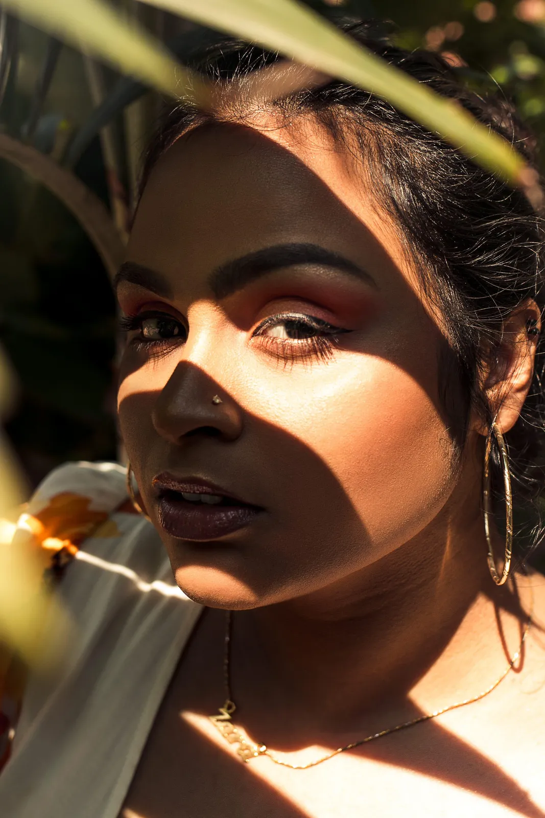
When a colour washes you out, it is draining the natural vibrancy from your skin and features. The effect is a loss of definition: your face looks flatter, your features less distinct, the boundary between your skin and the fabric less clear. You look, in a word, faded.
This is a physical optical phenomenon, not a matter of opinion. Certain colours actively reflect their own tone back onto the skin nearest to them. When that reflected tone conflicts with your skin's natural undertone, it suppresses the warmth, clarity, or depth that makes your complexion look alive.
The result is not that you look bad. It's that you look like a diminished version of yourself. The colour is essentially competing with you rather than working with you.
Why do some colours wash some people out but not others?
Because people have different colouring, and colour is not neutral.
Every colour has three characteristics: temperature (warm or cool), depth (light or dark), and saturation (clear or muted). Every person also has these three characteristics in their natural colouring. When a colour's characteristics align with a person's colouring, the effect is harmony. When they conflict, the effect is dissonance, and that dissonance shows on the face.
A pale, cool-toned person wearing a warm, golden yellow is experiencing a temperature conflict. The warm yellow pulls warmth toward it, and in doing so, makes the cool skin look greyer and more washed out by comparison.
A person with rich, deep colouring wearing a very pale, muted tone is experiencing a depth conflict. The light colour doesn't have enough presence to hold its own against deep features, so the face looks heavy and the colour looks blank.
Neither of these is about attractiveness. It's about the relationship between the colour and the colouring.
Which colours are most likely to wash people out?
There is no single colour that washes everyone out, because it depends entirely on the individual. However, certain categories cause problems more consistently than others:
Colours that are too close to your skin tone. When a colour is very similar in depth and tone to your skin, the contrast between face and fabric disappears. Without contrast, features flatten. This is why people with fair skin often look washed out in very pale blush or cream tones that don't have enough separation from their complexion.
Colours with the wrong undertone. A warm-toned person in a cool, ashy colour. A cool-toned person in a golden, yellow-based colour. The undertone mismatch creates a dulling effect that reads as washed out regardless of the depth of the colour.
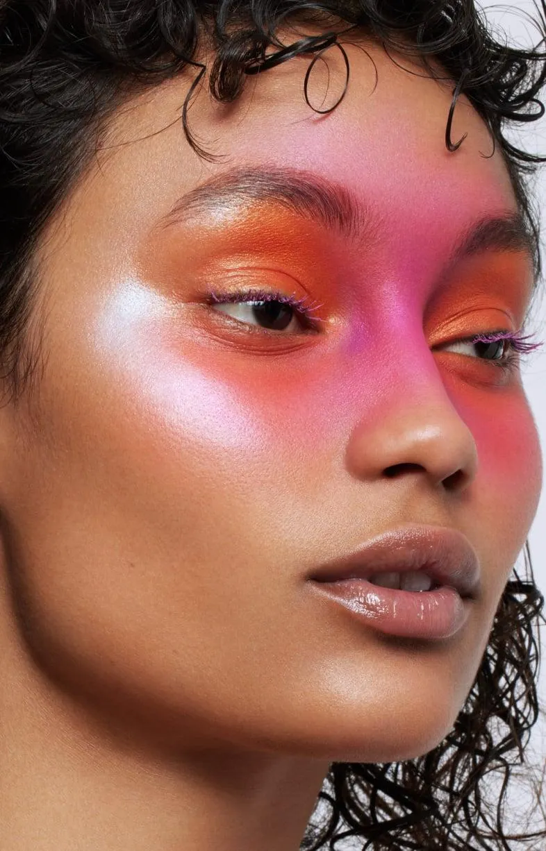
Colours that are too muted for high-contrast colouring. People with naturally high contrast between their features, dark hair, light skin, bright eyes, need colours with some saturation to match. Wearing very blended, greyed-down tones makes them look flat because the colour has less energy than the person.
Stark white and off-white, depending on season. White is complex. A pure, cool white can be extraordinary on some people and draining on others. An ivory or cream can do the same in reverse. The specific quality of white that works depends entirely on undertone and depth.
Is being "washed out" the same as being pale?
No, and this is an important distinction.
Pale skin is not washed out skin. Many people with very fair complexions look vivid, defined, and luminous in the right colours. The right colours for their season create clarity, not pallor. The wrong colours create that draining, undefined quality that people call washed out.
Equally, being washed out is not exclusive to fair skin. People with deep or medium complexions can also be washed out by colours that conflict with their undertone or overwhelm their natural colouring. It just presents slightly differently, as a heaviness or dullness rather than pallor.
The author's perspective
In my experience working with colour, the most common mistake I see is people treating "washed out" as evidence that they don't suit colour, or that they should stick to safe, neutral choices. The opposite is usually true.
I believe every person has a natural beauty that is specific to them, and that colour is one of the most powerful tools for making that beauty visible. When someone looks washed out, it isn't a sign that colour doesn't work for them. It's a signal that the wrong colour is being used. Find the right one, and the same face that looked faded in one shade will look extraordinary in another.
This is the part of colour analysis I find most compelling: not the rules, but the revelation. The right colour doesn't change how you look. It shows you how you already look, at your best.
How do I know which colours wash me out?
The most reliable method is natural daylight with no makeup. Hold a piece of clothing close to your face and look at your skin rather than the fabric. Watch for:
Shadows appearing or deepening under your eyes or around your nose. Skin looking greyer or more uneven. Features looking less defined. A sense that the face is receding from the fabric.
If any of these happen, the colour is working against you. If your skin looks clearer and your features more defined, the colour is working for you.
Doing this test across a range of colours will quickly show you patterns. Certain colour families will consistently flatter; others will consistently drain. Those families correspond to your colour season.
What is colour season and how does it prevent this problem?
Colour season is the framework used by professional colour consultants to identify the full palette of colours that work with your specific colouring. It maps your undertone, your depth, and your saturation needs to a set of colours that will never wash you out, because every colour in your palette is chosen specifically to harmonise with who you are.
Once you know your season, the guesswork stops. You know your colours, you know your neutrals, and you know the shades to avoid. Shopping becomes faster, your wardrobe becomes more coherent, and that experience of looking in the mirror and seeing a diminished version of yourself becomes rare.
Questions, answered
Yes. Liking a colour aesthetically and looking good in it are different things. Many people are drawn to colours that don't work for their specific colouring, and they wonder why they never quite look right in something they love. This is very common, and it's exactly what colour analysis addresses.
Yes, to a degree. A matte fabric reflects less light than a shiny or metallic one, which changes how intensely a colour interacts with skin. However, the underlying colour temperature and depth are the primary factors. A colour that washes you out in matte will also wash you out in satin, just with slightly different intensity.
Makeup can partially counteract the effect, but it doesn't eliminate it. If a colour is genuinely wrong for your undertone, it will still dull the overall impression even with full makeup. The right answer is to find colours that work with your bare skin, then let makeup enhance rather than compensate.
Not universally, but certain shades come close for many people. A cool, flat grey with no depth or warmth tends to be draining for a wide range of colouring types. Equally, pure white works for fewer people than believe it does. But for every shade that drains most, there is someone for whom it is precisely right.
mycolours.ai identifies your exact season from two selfies, building a personal palette of 19 colours that will never wash you out, alongside makeup matches, hair guidance, and a capsule wardrobe. Built on professional colour consultancy expertise, not a generic algorithm. Start your analysis at mycolours.ai.
Melissa O'Neill
Style Editor at mycolours.ai
Melissa O'Neill is the style editor at mycolours.ai. She started her career on the Paul Smith concession at Harrods, where she learned that the difference between looking ordinary and looking incredible often comes down to colour, not cost. She has since built and run luxury boutique hotels, businesses where every detail, from the linen shade to the lighting warmth, was chosen to make people feel something. She started mycolours.ai because she believes the tools to look and feel your best should not cost £300 or require a stylist on speed dial.
More on colour
Why do some colours make me look tired?
A perfectly nice outfit can still leave you looking drained. Here is how undertone, depth and contrast decide whether a colour lifts your face or flattens it.

The colour mistake most women make without knowing it
Most wardrobes are built on neutrals that feel safe, but neutrals are not neutral. Here is why getting the temperature of your basics right changes everything.
Why black doesn't suit everyone, and what to wear instead
Black is supposed to go with everything and suit everyone, but for a significant proportion of people it is one of the most draining colours they own.
Your exact colours, from two selfies.
mycolours reads your skin, hair, and eyes and returns your colour season, a 19-colour palette, makeup matches, hair guidance, and a capsule wardrobe in 60 seconds, for £7.99.