Why the same colour looks incredible on one person and terrible on another
The answer is not about skin tone in the way most people think.
You have seen it happen. A colour that looks extraordinary on your friend looks completely wrong on you. Or a shade you assumed would suit everyone turns out to be intensely specific. Or you buy something because you saw it on someone else and it looked so good, and then it arrives and something is off in a way you cannot quite name.
This is one of the most common frustrations in dressing, and it has a specific explanation. It is not about who is more attractive. It is not random. It is colour science, and once you understand it, you can stop making the same mistake in every changing room.
Why does colour look different on different people?
Every colour has three measurable characteristics: temperature (warm or cool), depth (light or dark), and saturation (clear or muted).
Every person also has these three characteristics in their colouring. Your skin has an undertone that is warm, cool, or neutral. Your overall colouring has a depth, ranging from very light to very deep. And your features have a quality that is either clear and high-contrast or soft and blended.
When a colour's characteristics align with a person's characteristics, the colour reflects in harmony with the skin. The skin looks clearer, the features more defined, the overall impression more alive and coherent.
When those characteristics conflict, the colour reflects that conflict back onto the face. The skin looks dull, or sallow, or tired. The features look less defined. The colour appears to sit on top of the person rather than working with them.
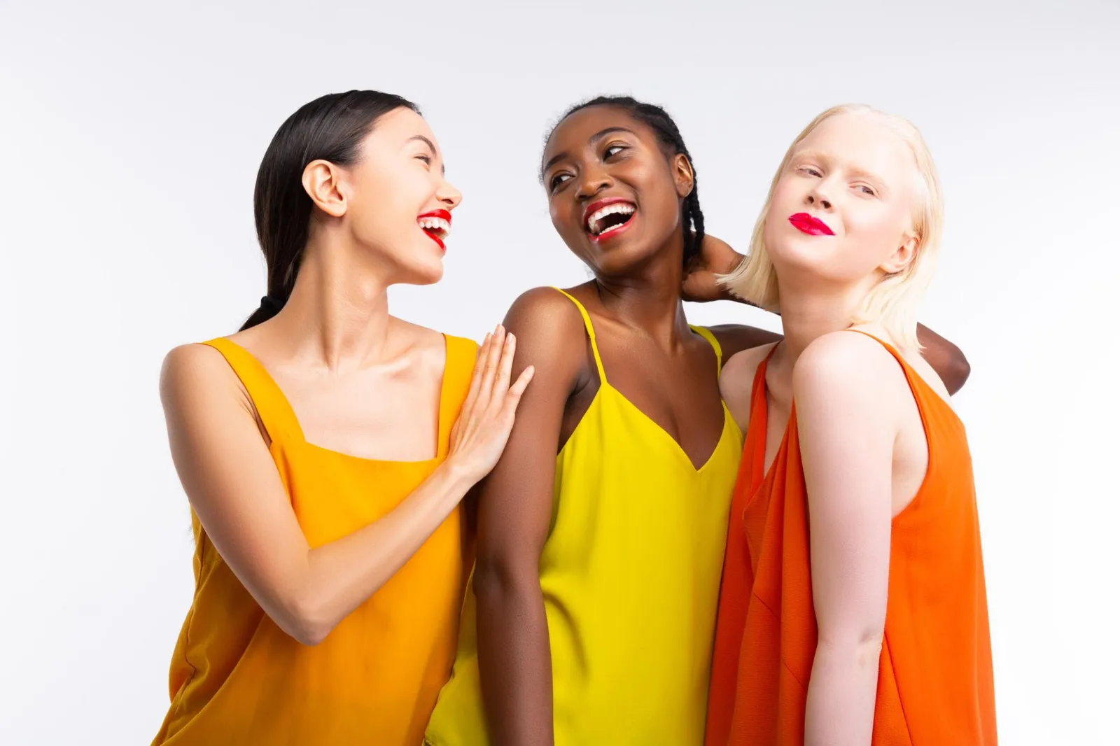
This is why the same shade of red can make one person look extraordinary and another look exhausted. It is not the red. It is the relationship between that particular red and that particular person.
Temperature: why warm colours suit some people and drain others
The most common source of colour mismatch is temperature. Every colour has either a warm (yellow-based) or cool (blue-based) undertone. So does every person's skin.
A warm-toned person wearing a warm colour experiences harmony at the undertone level. The golden warmth of the colour reflects the golden warmth of the skin. The result is radiance.
A cool-toned person wearing the same warm colour experiences conflict. The warm undertone in the colour sits against a cool base in the skin, and the result is that the skin looks sallow, greyish, or unwell, because the colour is pushing against the skin's natural base rather than reinforcing it.
This is why a golden mustard that looks extraordinary on your warm-toned friend makes you look like you haven't slept. It's not the mustard. It's the temperature mismatch.
Depth: why the same shade can feel heavy or washed out
Beyond temperature, the depth of a colour also matters. A very deep, saturated navy worn by someone with light, delicate colouring can overpower them. The colour has more presence than the person's features, and the result is that the navy reads and the person recedes.
The same navy worn by someone with deep, high-contrast colouring looks powerful and considered. The depth of the colour matches the depth of the person.
Neither person is wrong to like navy. But one navy may be the right navy, and the other may not.
Saturation: why some people look great in vivid colours and others don't
Saturation refers to how clear or muted a colour is. A vivid scarlet is highly saturated. A dusty rose is muted. Both can be the right choice, depending on the person.
People with high-contrast, clear colouring often look extraordinary in vivid, fully saturated colours. These colours match the energy of their natural features. Wearing muted versions of the same colours can make them look washed out, because the colour has less presence than the person.
People with softer, more blended colouring tend to look best in muted colours. Their features have a gentle quality that muted colours reinforce. Vivid, fully saturated colours can overpower them in the same way a very deep colour can overpower light colouring.
The author's perspective
I want to say something clearly about this: the reason colour works differently on different people has nothing to do with who looks better or who has more flattering colouring. Every combination of undertone, depth, and saturation is beautiful. Every season has extraordinary colours within it. Some of the most spectacular colouring I have encountered belongs to seasons that are sometimes treated as understated, and some of the most striking people I have worked with have colouring that the conventional beauty canon doesn't always celebrate.
The point of understanding your colours is not to rank yourself against anyone else. It is to understand the specific visual territory that is yours, and to dress within it with intention. The effect is not about competition. It is about clarity.
The three variables, working together
This is the part most colour advice misses. Temperature, depth, and saturation all have to be right simultaneously for a colour to work fully.
A colour can be the right temperature but the wrong depth. Or the right depth but the wrong saturation. Or any combination of these mismatches. Getting one variable right reduces the problem but does not eliminate it.
This is why the answer to "what colours suit me?" is more specific than "wear warm colours" or "avoid pastels." Those are starting points. The full answer requires understanding all three variables in combination, which is what a professional colour analysis does.
How to use this in practice
Once you understand these three variables, you can start to self-diagnose why certain colours work and others don't:
If a colour makes you look tired or sallow, the temperature is probably wrong.
If a colour makes you look heavy or overwhelmed, the depth is probably wrong.
If a colour makes you look washed out, either the saturation is too muted for your features, or the colour is too close in depth to your skin.
If a colour makes your skin look grey or dull, the undertone is conflicting.
Questions, answered
Red exists in many different versions: warm reds with orange in them, cool reds with blue in them, deep crimsons, vivid scarlets, muted burgundies. The red that works for your friend has characteristics that align with her colouring. The version that works for you may be a different red entirely.
Skin tone and undertone are related but different. Skin tone refers to the surface depth of your complexion (fair, medium, deep). Undertone refers to the colour base beneath the surface (warm, cool, neutral). Colour analysis works primarily with undertone, depth, and saturation, not surface skin tone alone.
Yes, very much so. Two people with the same surface skin tone can have completely different undertones, depths of feature, and saturation levels. They may be in entirely different seasons and have completely different optimal palettes.
Not universally, but some colours come close for particular colouring profiles. The concept of "universal colours" is largely a myth that creates wardrobe mistakes at scale.
mycolours.ai identifies your exact season from two selfies, assessing undertone, depth, and saturation in combination to build your personal palette of 19 colours. Start your analysis at mycolours.ai.
Melissa O'Neill
Style Editor at mycolours.ai
Melissa O'Neill is the style editor at mycolours.ai. She started her career on the Paul Smith concession at Harrods, where she learned that the difference between looking ordinary and looking incredible often comes down to colour, not cost. She has since built and run luxury boutique hotels, businesses where every detail, from the linen shade to the lighting warmth, was chosen to make people feel something. She started mycolours.ai because she believes the tools to look and feel your best should not cost £300 or require a stylist on speed dial.
More on colour
Why do some colours make me look tired?
A perfectly nice outfit can still leave you looking drained. Here is how undertone, depth and contrast decide whether a colour lifts your face or flattens it.

The colour mistake most women make without knowing it
Most wardrobes are built on neutrals that feel safe, but neutrals are not neutral. Here is why getting the temperature of your basics right changes everything.
Why black doesn't suit everyone, and what to wear instead
Black is supposed to go with everything and suit everyone, but for a significant proportion of people it is one of the most draining colours they own.
Your exact colours, from two selfies.
mycolours reads your skin, hair, and eyes and returns your colour season, a 19-colour palette, makeup matches, hair guidance, and a capsule wardrobe in 60 seconds, for £7.99.